Wicked
Veteran Member

Posts: 1,999
| Likes: 1,045
|
Post by Wicked on Aug 21, 2016 18:47:59 GMT
It looks nice but it's too controlling. I like to scroll at my own pace. Also half the stuff from the other site is missing. It doesn't work on mobile devices which is a big part of using the site since the majority of people with a PC also have a phone. Current staff doesn't show everyone nor do I see links to the forum, etc. Scrolling doesn't work unless you click in the window. My brutally honest tl;dr opinion is: It looks beautiful and is very modern but it's horrible to use, lacking in areas and not very responsive (feels too...fullscreen and inyourface too). I agree to this - don't restrict scrolling or attempt to implement "smooth" scrolling, it's fucking horrible. It kinda works on mobile but it could be vastly improved. |
|
aggelosQQ
Club 4000 Member
Posts: 6,439
| Likes: 4,127
|
Post by aggelosQQ on Aug 21, 2016 18:57:33 GMT
It looks nice but it's too controlling. I like to scroll at my own pace. Also half the stuff from the other site is missing. It doesn't work on mobile devices which is a big part of using the site since the majority of people with a PC also have a phone. Current staff doesn't show everyone nor do I see links to the forum, etc. Scrolling doesn't work unless you click in the window. My brutally honest tl;dr opinion is: It looks beautiful and is very modern but it's horrible to use, lacking in areas and not very responsive (feels too...fullscreen and inyourface too). Please don't take offence to this, you're a very talented developer. I could try to make the page without the scroll effect, if most of you wanted to, but I'll need to pretty much re-make the page again from scratch. The way the website is built doesn't allow me to list every administrator, it's not a big deal though, is it? To be honest, I only kept the necessary stuff from the previous version of the website and tried to make the page more user-friendly instead of having a huge amount of text taking up all the page. About the mobile compatibility, I don't know if I should pay that much attention to it, the previous version wasn't compatible either, and the new page's is similar to the previous one, you have to zoom (if anyone wants to try and make it mobile-friendly, go ahead). Edit: If I remove the scrolling effect, it might make the page more mobile-friendly. aggelosQQ - A mistake/glitch I have noticed is this: When you write a long paragraph in the 'Rules' section, the sub-title is cut off, for example, it is supposed to say 'No Impersonation', though it has been cut off, maybe find a way around this, or try to shorten down the paragraph? Can you contact me on Discord? aggelosQQ#7499, I'll try to fix it. EDIT: @legendarycraft can you try again and tell me if it's fixed or not, please? |
|
Deleted
Deleted Member
Posts: 0
|
Post by Deleted on Aug 21, 2016 19:19:37 GMT
EDIT: AndySixx can you try again and tell me if it's fixed or not, please? Fixed. |
|
OfficialLeo_
Veteran Member
Eeeeeek...
Posts: 1,761
| Likes: 990
|
Post by OfficialLeo_ on Aug 21, 2016 19:36:08 GMT
Omg, such an improvement. That's amazing.
|
|
Qibb
Full Member
True Disclosure
Posts: 129
| Likes: 42
|
Post by Qibb on Aug 21, 2016 19:51:07 GMT
Classy  |
|
Three
Veteran Member
PM me for help!
Posts: 336
| Likes: 86
|
Post by Three on Aug 21, 2016 19:55:16 GMT
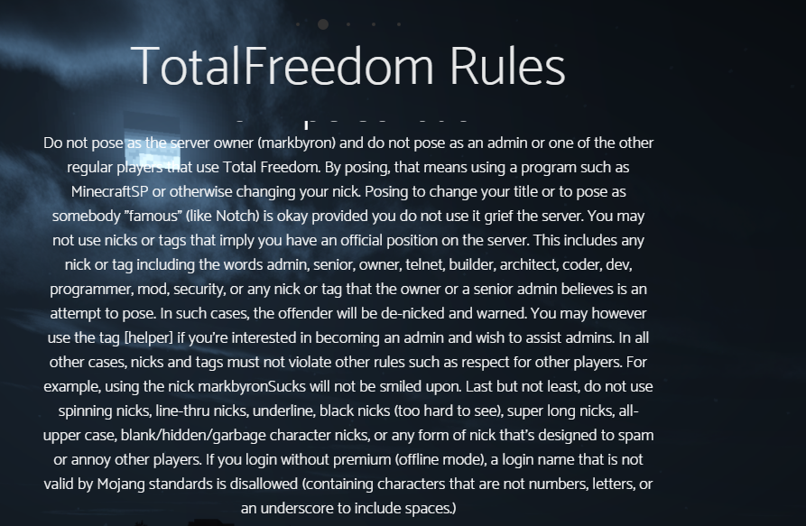
aggelosQQ The Moon from the backdrop hides (or makes it very difficult to read) a few of the words of each section. Maybe take a different screenshot?
|
|
Oliver
Club 4000 Member
Use @srpunchwood51 to tag me.
Posts: 4,596
|
Post by Oliver on Aug 21, 2016 20:29:26 GMT
It looks nice but it's too controlling. I like to scroll at my own pace. Also half the stuff from the other site is missing. It doesn't work on mobile devices which is a big part of using the site since the majority of people with a PC also have a phone. Current staff doesn't show everyone nor do I see links to the forum, etc. Scrolling doesn't work unless you click in the window. My brutally honest tl;dr opinion is: It looks beautiful and is very modern but it's horrible to use, lacking in areas and not very responsive (feels too...fullscreen and inyourface too). Please don't take offence to this, you're a very talented developer. I could try to make the page without the scroll effect, if most of you wanted to, but I'll need to pretty much re-make the page again from scratch. The way the website is built doesn't allow me to list every administrator, it's not a big deal though, is it? To be honest, I only kept the necessary stuff from the previous version of the website and tried to make the page more user-friendly instead of having a huge amount of text taking up all the page. About the mobile compatibility, I don't know if I should pay that much attention to it, the previous version wasn't compatible either, and the new page's is similar to the previous one, you have to zoom (if anyone wants to try and make it mobile-friendly, go ahead). Edit: If I remove the scrolling effect, it might make the page more mobile-friendly. Why would you have to? Also, yes. I do believe having a list of all the admins is very important. One thing you must learn in web development is making your website flexible and easy to modify, add and remove things not making each element depend on one thing. |
|
Deleted
Deleted Member
Posts: 0
|
Post by Deleted on Aug 21, 2016 20:41:26 GMT
Really truly amazing work, aggelos you are an outstanding web designer.
OFT: #AggelosForGlobalForumModerator
|
|
aggelosQQ
Club 4000 Member
Posts: 6,439
| Likes: 4,127
|
Post by aggelosQQ on Aug 21, 2016 21:02:15 GMT
I could try to make the page without the scroll effect, if most of you wanted to, but I'll need to pretty much re-make the page again from scratch. The way the website is built doesn't allow me to list every administrator, it's not a big deal though, is it? To be honest, I only kept the necessary stuff from the previous version of the website and tried to make the page more user-friendly instead of having a huge amount of text taking up all the page. About the mobile compatibility, I don't know if I should pay that much attention to it, the previous version wasn't compatible either, and the new page's is similar to the previous one, you have to zoom (if anyone wants to try and make it mobile-friendly, go ahead). Edit: If I remove the scrolling effect, it might make the page more mobile-friendly. Why would you have to? Also, yes. I do believe having a list of all the admins is very important. One thing you must learn in web development is making your website flexible and easy to modify, add and remove things not making each element depend on one thing. I will try. Hope you will like the upcoming results c: |
|
Deleted
Deleted Member
Posts: 0
|
Post by Deleted on Aug 21, 2016 21:17:51 GMT
This is something that is more up for debate, but what if we add some images from masterbuilders' builds? I really do think that would give even more meaning to the rank and would also spruce up the site! |
|
iDelRey
Veteran Member
All art is quite useless.
Posts: 1,863
| Likes: 988
|
Post by iDelRey on Aug 21, 2016 21:26:20 GMT
Should add:
IP to server.
Link to Forum
Maybe?:
Link to conduct code?
History page?
|
|
aggelosQQ
Club 4000 Member
Posts: 6,439
| Likes: 4,127
|
Post by aggelosQQ on Aug 21, 2016 21:35:07 GMT
This is something that is more up for debate, but what if we add some images from masterbuilders' builds? I really do think that would give even more meaning to the rank and would also spruce up the site! Sure thing! |
|
aggelosQQ
Club 4000 Member
Posts: 6,439
| Likes: 4,127
|
Post by aggelosQQ on Aug 21, 2016 21:36:18 GMT
Should add: IP to server. Link to Forum Maybe?: Link to conduct code? History page? The forum link is on the navigation bar. I'll add the IP and what's the History page? |
|
Deleted
Deleted Member
Posts: 0
|
Post by Deleted on Aug 21, 2016 22:34:58 GMT
This is something that is more up for debate, but what if we add some images from masterbuilders' builds? I really do think that would give even more meaning to the rank and would also spruce up the site! This. The website looks great for a version one release. I see it's still in the developmental stage and a lot of improvements could be made, but it already looks a lot better and more up-to-date than the original website. |
|
Deleted
Deleted Member
Posts: 0
|
Post by Deleted on Aug 21, 2016 22:53:43 GMT
For mark in the list, it should be markbyron or Markbyron. No uppercase B.
|
|


 - Achieved June 3rd, 2016